Magn8
Project: Open Brief
Year: 2025
Services: Visual Identity, Packaging
About the project
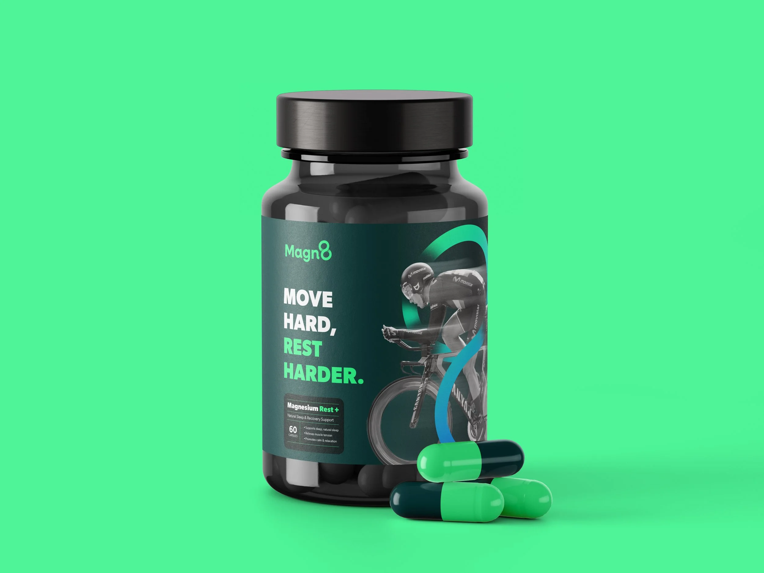
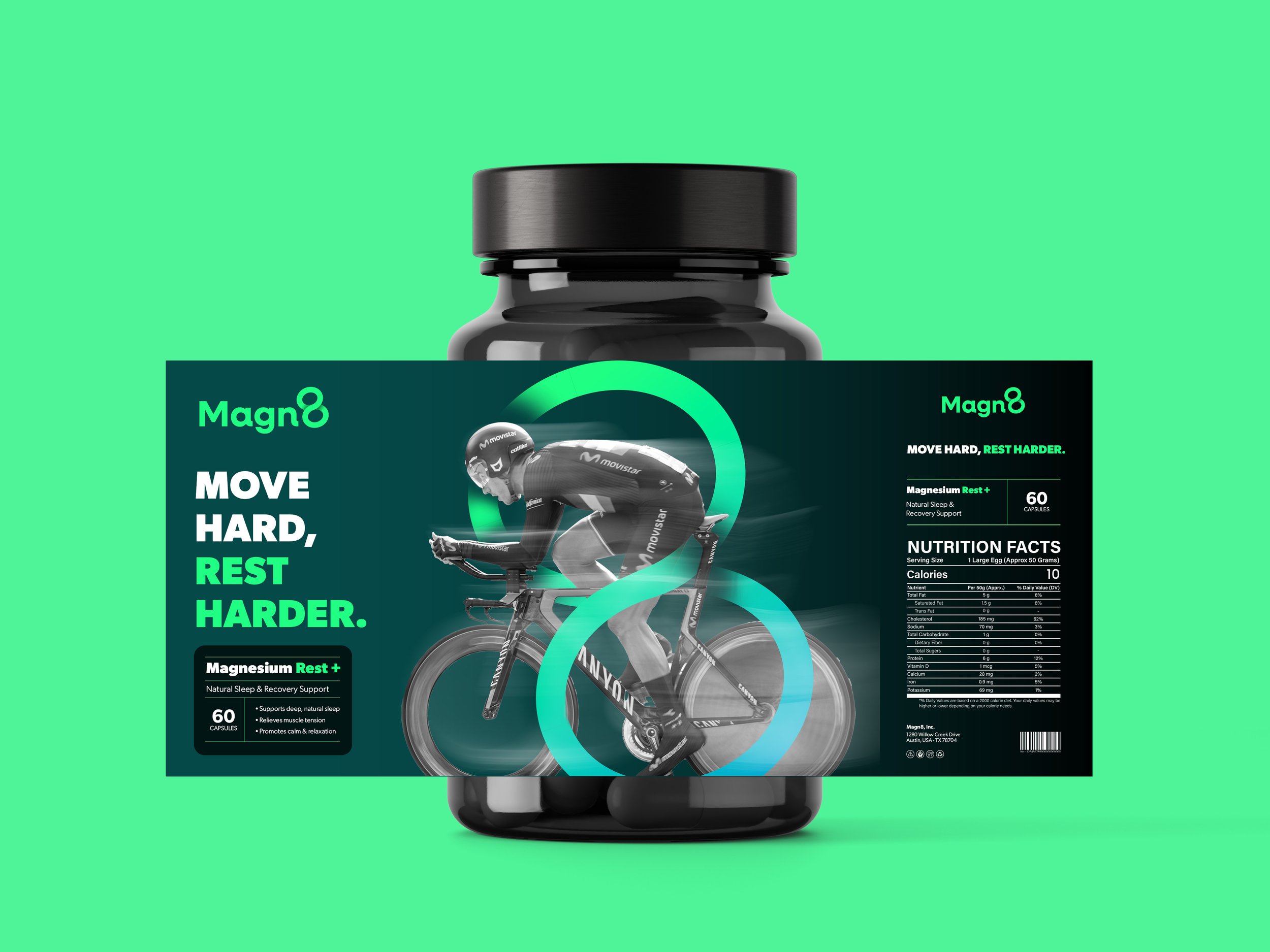
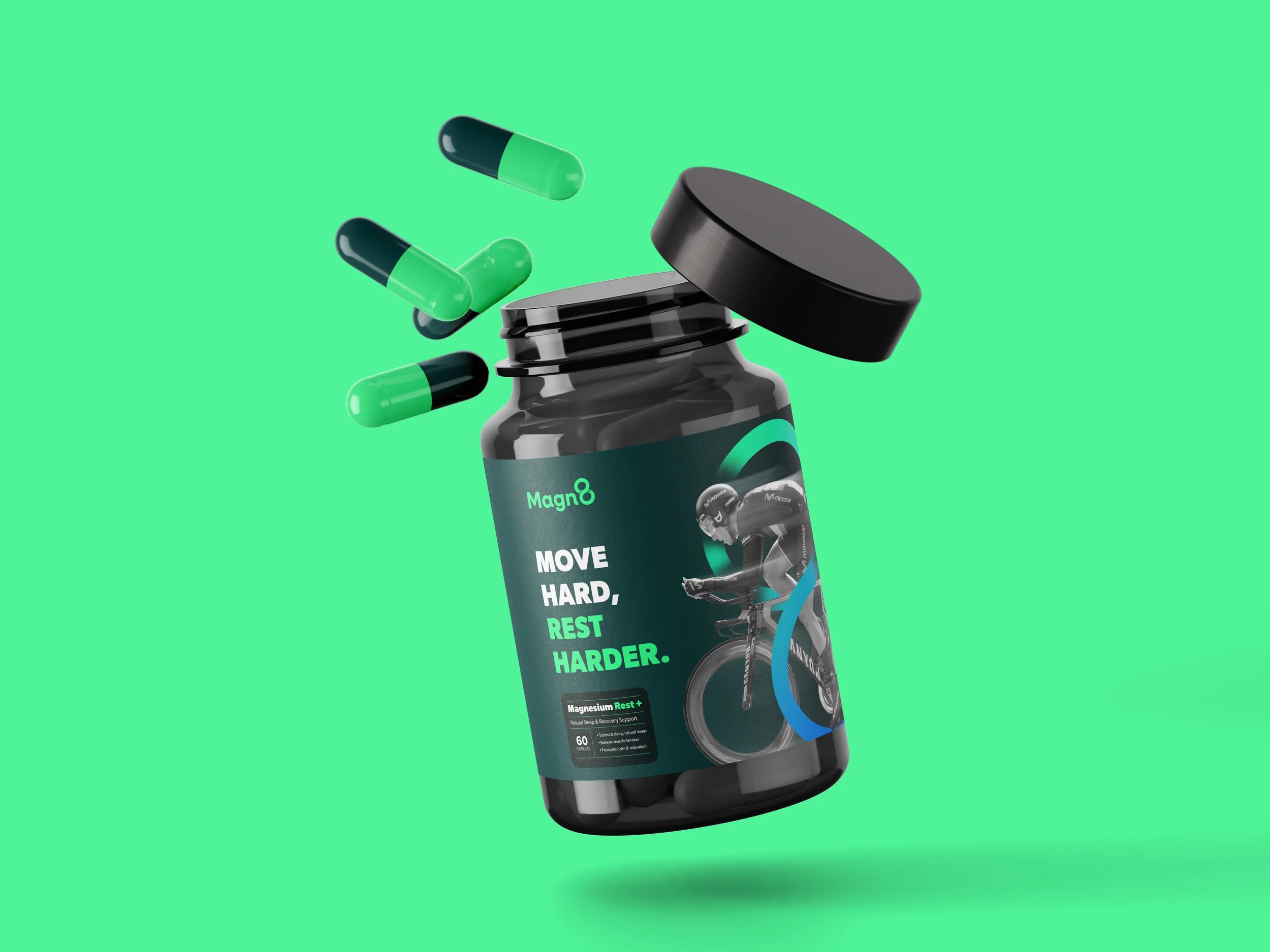
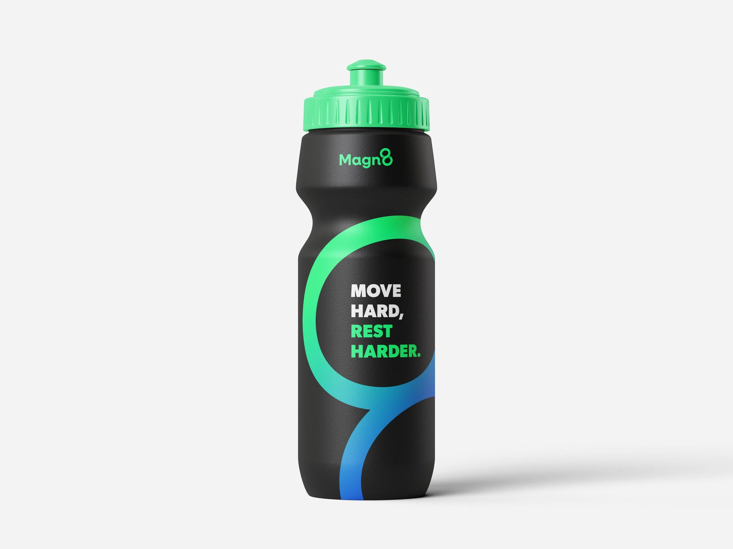
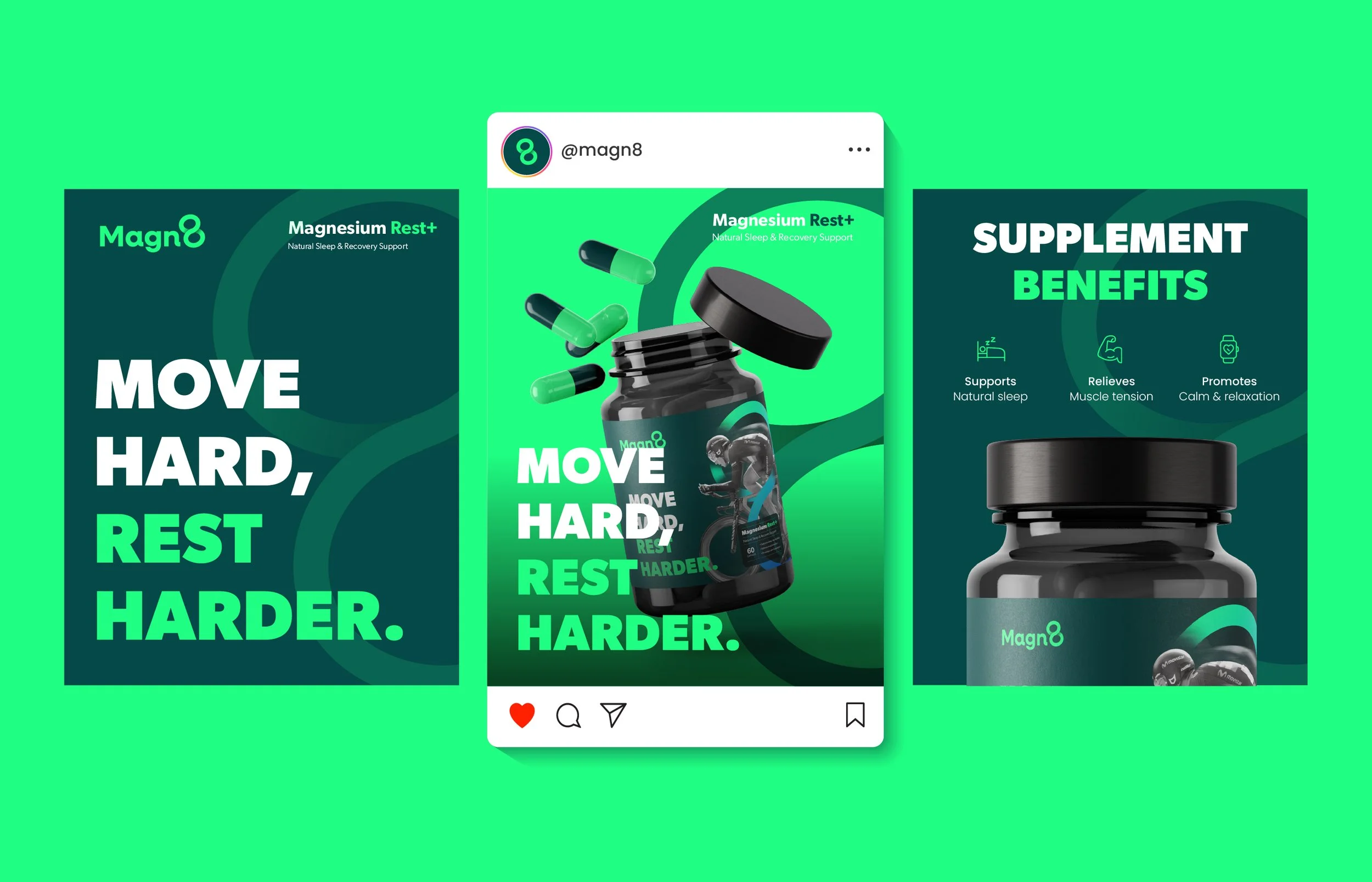
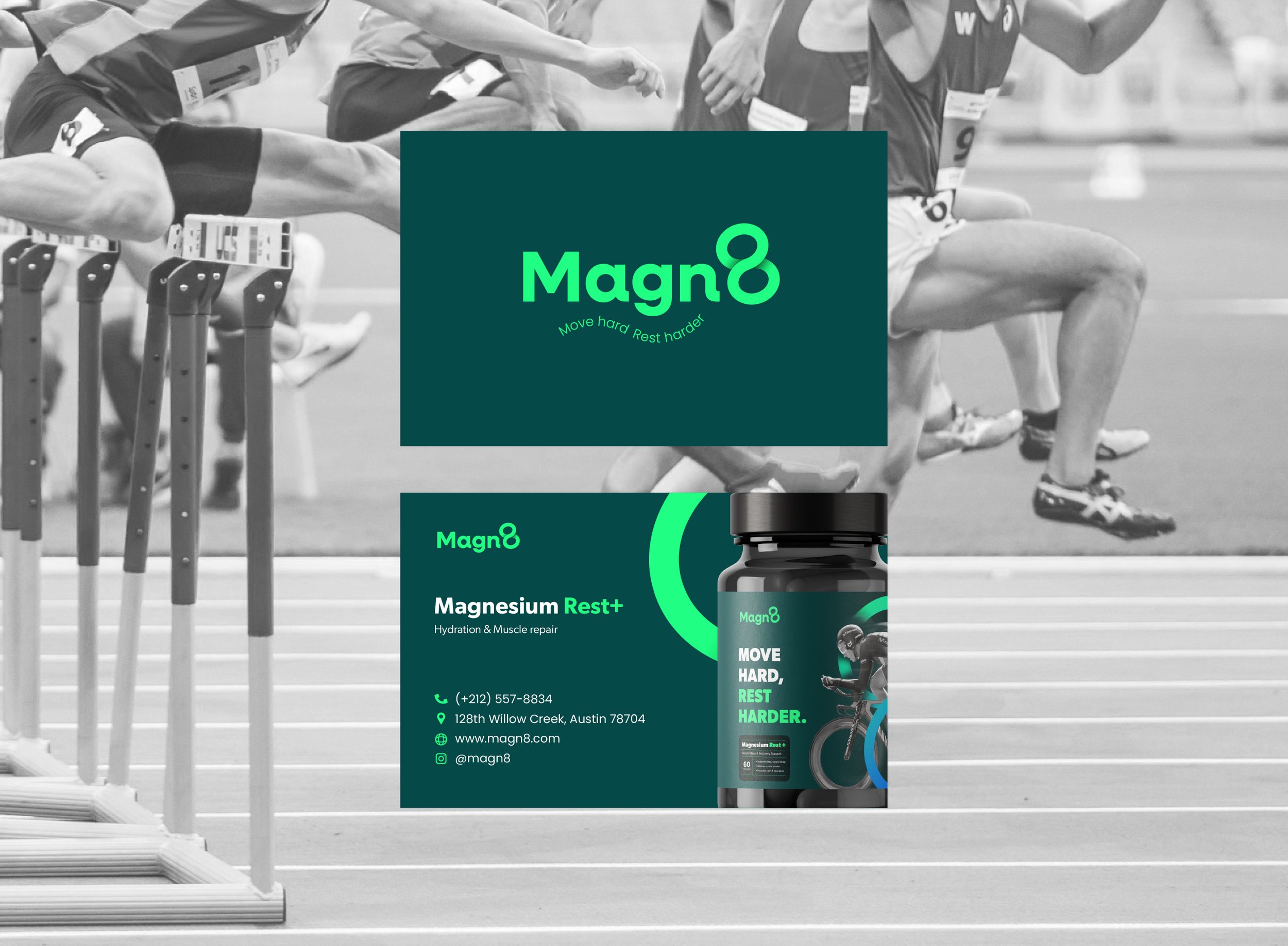
MAGN8 (pronounced Mag-nate) offers magnesium tablets designed for quick recovery, built for athletes who move hard and rest harder. The goal of this project was to create a brand identity that feels athletic, clean, bold, and functional, reflecting the product’s performance-driven nature.
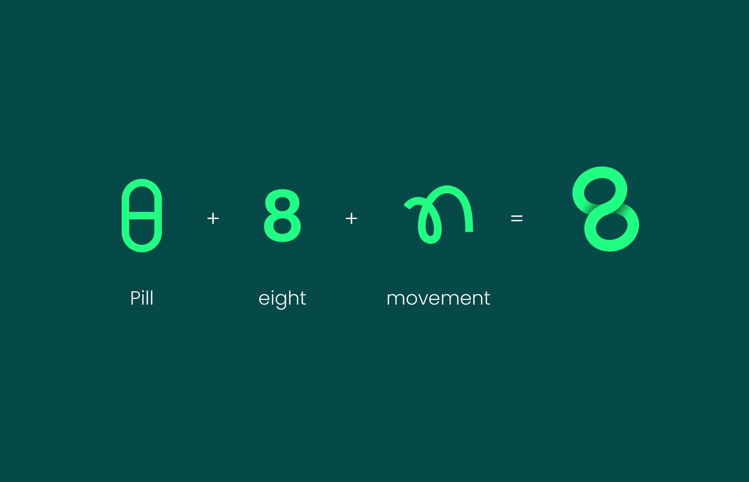
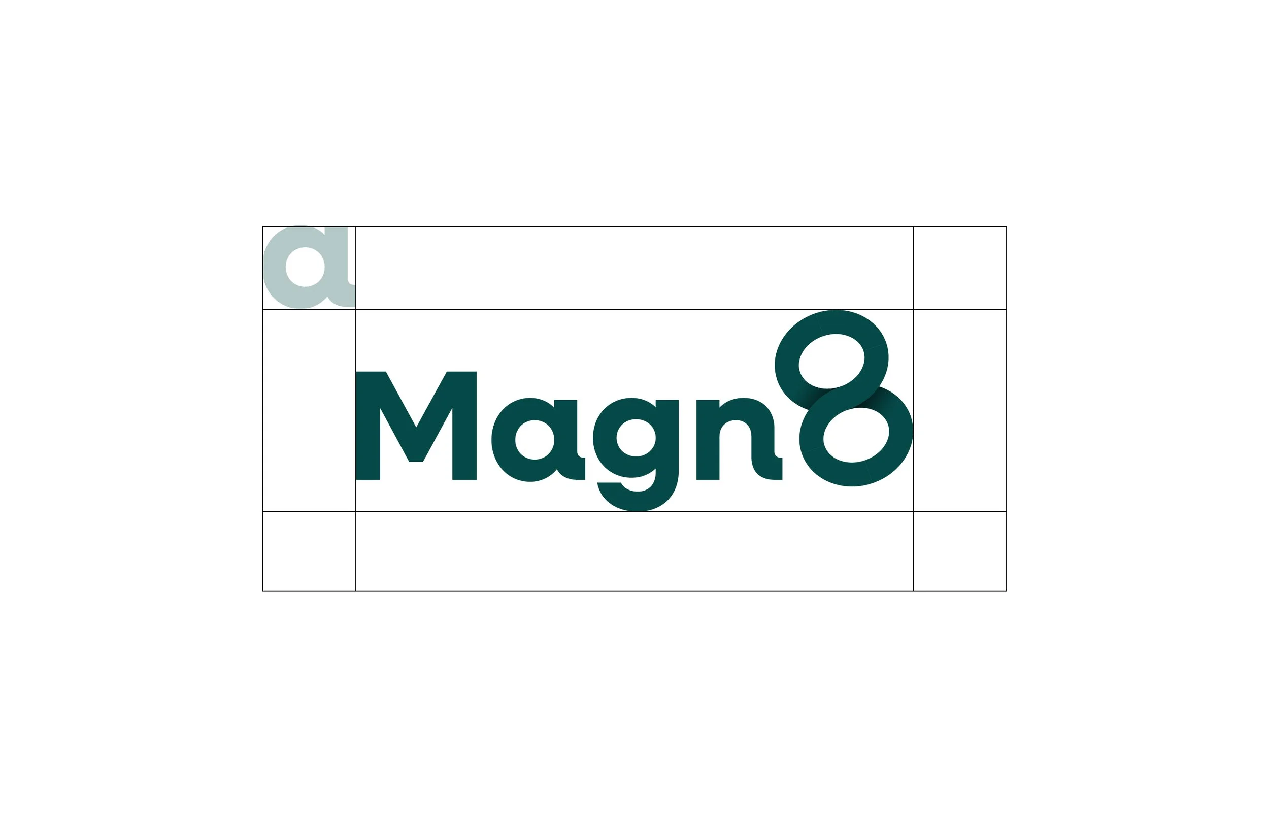
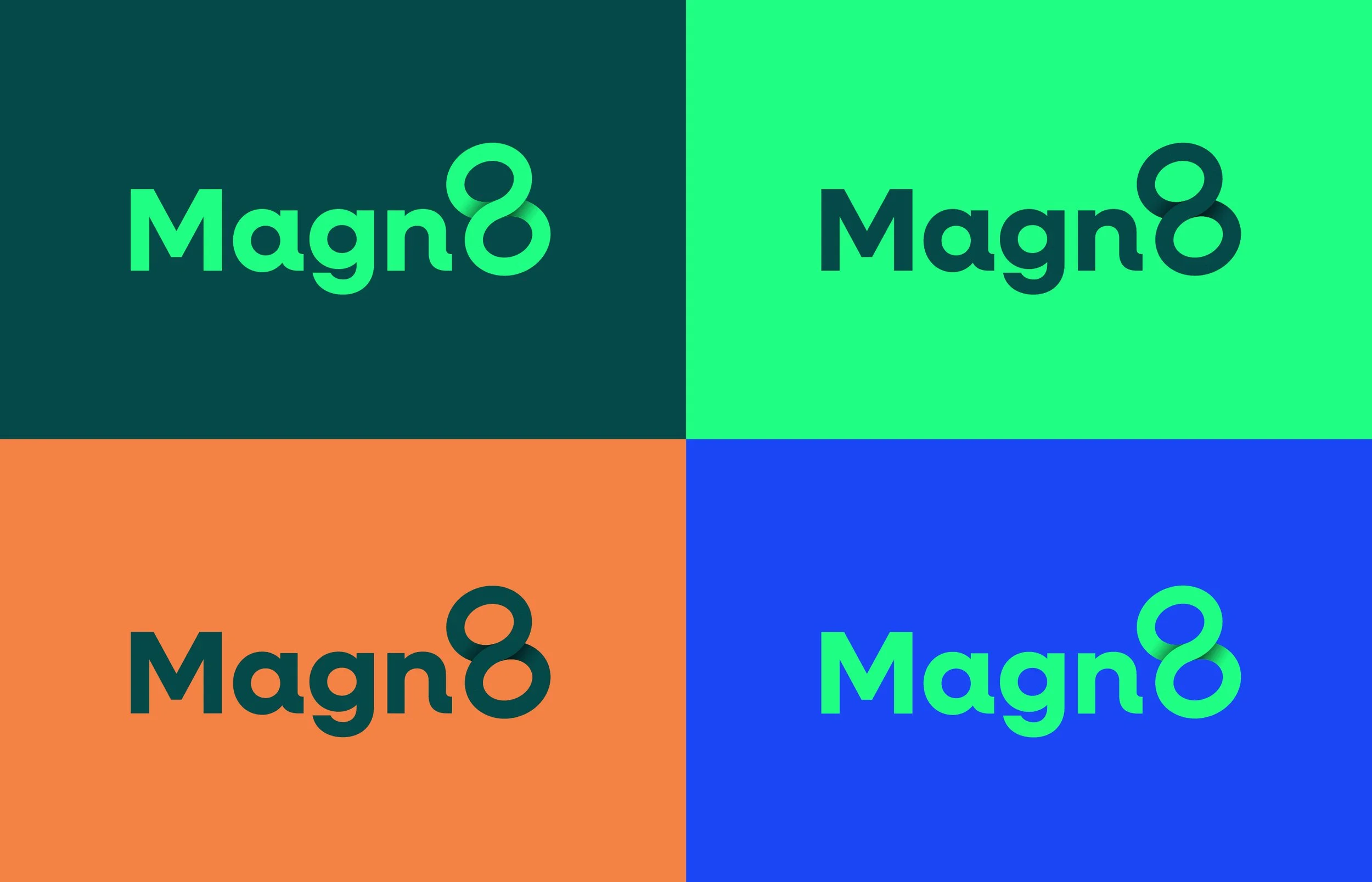
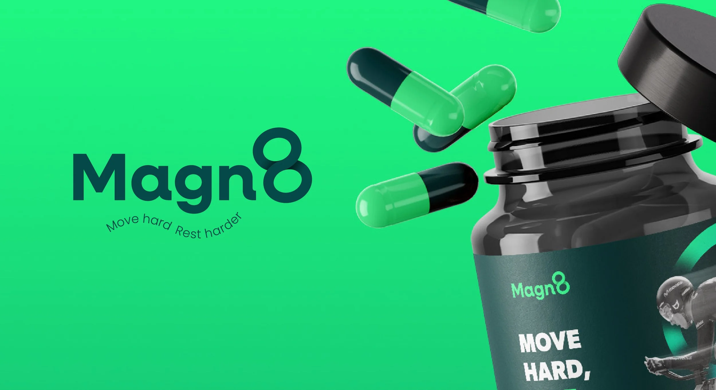
A key design challenge was crafting a logo that clearly read as “MAGN8”, balancing the fusion of “Magn” + “8” without letting the “8” feel like a detached icon. The result is a cohesive wordmark that feels energetic yet refined, paired with packaging that emphasizes clarity, strength, and modern simplicity.
